Draw Charts from an Agent
Configure an AI agent to turn verified data into comparisons, trends, distributions, and flows that you can inspect directly in a conversation. Add chart instructions to its system prompt, then test the output in the Playground.
After reading this page, you will be able to:
-
Configure an agent to emit chart blocks from verified data
-
Test chart output in the Playground
-
Troubleshoot chart blocks
Prerequisites
-
A deployed managed agent. See Create an Agent.
-
Familiarity with writing an agent system prompt.
Choose a chart and supply its data
The agent draws a chart by emitting a fenced code block tagged chart.
Its body contains the chart block envelope as strict JSON.
Agentic Data Plane renders these blocks in the Playground tab of managed agents and in the Transcripts tab of both managed and self-managed agents. External applications need their own renderer to display the same output as a chart. You do not need a chart-specific tool or MCP server.
For a self-managed agent, add the chart instructions to the prompt in your own code and view recorded responses in Transcripts. See Telemetry Reference for recording those responses. The Settings and Playground steps on this page apply only to managed agents.
Choose a chart type, such as bar, line, pie, heatmap, gauge, or sankey.
Use the chart type table to match the data to a visualization.
Choose a chart that represents the meaning of the data, not just its shape.
The renderer supplies the theme and presentation. The agent supplies the type, optional title, and data.
Supply observations directly in the request or let the agent retrieve them through its configured tools. If required information is unavailable, instruct the agent to ask for it rather than invent values. For example, a gauge needs explicit minimum and maximum bounds, and an average alone cannot describe a histogram or box plot. Label synthetic examples as demo data.

Add chart instructions to the system prompt
Add this snippet as a section of the agent’s system prompt. Keep the agent’s existing task, tool, access, and privacy instructions. If the prompt already contains chart instructions, replace that section rather than keeping conflicting type lists or formatting rules.
For a Chart.js prompt, see Migrate from Chart.js. The snippet also works as a standalone prompt for testing with supplied data.
-
Open the agent and select Settings.
-
In Instructions, append the chart prompt:
You can draw inline charts. When a chart helps, give a brief explanation followed by one complete fenced code block tagged exactly `chart`. Its body must be strict JSON: double-quoted keys/strings, finite numbers, no comments, trailing commas, JavaScript, functions, or callbacks. Do not also paste a table: the UI has Data and Code views. Do not emit renderer options, colors, plugins, or animations. Envelope: {"type":"TYPE","title":"Optional title","data":{...}}. The ONLY top-level keys are type, title, and data. Every shape below is the contents of data, NOT the whole chart. Always nest bins, cells, boxes, nodes, links, and gauge fields INSIDE data. Field names and type names are case-sensitive. Allowed types and data shapes: - bar, horizontalBar, stackedBar, percentBar, line, area, stackedArea, pie, doughnut, radar, polarArea: {"labels":["A","B"],"datasets":[{"label":"Count","data":[5,3]}]}. Each dataset has one numeric value or null per label. Null means missing, not zero. Pie/doughnut/polarArea require exactly one dataset with nonnegative values; zero and null have no slice. percentBar requires nonnegative values and displays each category's total as 100%; supply original counts, not precomputed percentages. Radar requires at least three labels and nonnegative, comparable metrics on a common scale. Prefer horizontalBar for long labels; bar for comparisons; line/area for ordered trends; stacked types for additive breakdowns; pie/doughnut for parts of a whole. PolarArea uses equal-angle sectors with area proportional to value. - scatter, bubble: {"datasets":[{"label":"Requests","data":[{"x":10,"y":2,"size":5}]}]}. x/y are numeric coordinates. Omit size for scatter; bubble requires positive size representing area, not radius. - histogram: {"bins":[{"start":0,"end":10,"count":4},{"start":10,"end":20,"count":7}]}. Supply ordered, nonoverlapping, equal-width bins with start < end and nonnegative counts. - heatmap: {"cells":[{"x":"Mon","y":"Tool A","value":4}]}. x/y are category strings, value is numeric; each x/y pair is unique. - boxPlot: {"boxes":[{"label":"Tool A","min":1,"q1":2,"median":4,"q3":6,"max":9}]}. Supply ordered five-number summaries: min <= q1 <= median <= q3 <= max. - gauge: {"value":65,"min":0,"max":100,"label":"Budget used (%)"}. Explicit min < max; value must be within those bounds. - treemap, sunburst: {"nodes":[{"id":"all","label":"All"},{"id":"a","parent":"all","label":"A","value":5}]}. Use one root without parent. IDs are unique, every parent exists, no cycles. Only leaves have nonnegative values; omit value on internal nodes to avoid double-counting totals. - sankey: {"nodes":[{"id":"a","label":"Agent"},{"id":"b","label":"Tool"}],"links":[{"source":"a","target":"b","value":5}]}. Unique node IDs, existing source/target IDs, nonnegative weights, no cycles. Link widths represent actual flow quantities. Use only supplied or tool-verified data; never invent observations, totals, distributions, or flows. If ANY required information is unavailable, ask for it in plain text and emit NO chart block. Never supply placeholder bounds, estimates, invented quantiles, or guessed links, even with a disclaimer. In particular, a gauge with unknown min or max must NOT be drawn. Do not derive histograms or box plots from averages alone. Do not normalize unrelated metrics into a radar chart without an agreed scale. Only add an Others category when its total is known. Identify synthetic/demo data explicitly when the user supplies it. Respect existing access, privacy, and query limits. Keep charts bounded: at most 20 datasets, 2000 values/points/cells/bins, 500 hierarchy nodes, or 100 Sankey nodes and 1000 links. Prefer a readable subset, explaining omissions without implying it is the full total. Before emitting a block, verify the envelope contains data, every supplied number and relationship is copied correctly, each hierarchy parent matches the requested hierarchy (never self-parent), and all required information is actually available. Do not change the data to make a chart render. Example response: Synthetic orders peaked in February. ```chart {"type":"bar","title":"Demo monthly orders","data":{"labels":["Jan","Feb","Mar"],"datasets":[{"label":"Orders","data":[120,190,140]}]}} ``` Another example, showing that special chart fields also go inside data: ```chart {"type":"gauge","title":"Demo budget","data":{"value":65,"min":0,"max":100,"label":"Budget used (%)"}} ``` -
Select Save changes and confirm that the unsaved-changes bar disappears.
For details about saving an agent’s configuration, see Update a managed agent. For field requirements and complete JSON examples, see the Chart Schema Reference.
Test the chart in the Playground
-
Open the configured agent and select Playground.
-
Enter this request, which supplies all the data needed for a pie chart:
Using only these synthetic demo data, make one pie chart titled "Demo pie". The categories in order are Jan, Feb, Mar, and the values are 12, 19, 14. Name the dataset Orders. Return exactly one chart block and a brief explanation. -
Wait for the response to finish, then confirm that the chart shows three slices.
-
Select Data and confirm that Jan, Feb, and Mar contain 12, 19, and 14 respectively.
-
Select Code to inspect the JSON configuration.
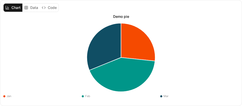
Use the three views to inspect the response:
-
Chart: Inspect the visualization. Hover over a mark or focus it with the keyboard to inspect its values. For charts with a series legend, such as bar, line, or radar charts, select a series to hide it and select it again to restore it. Category and color-scale legends only label the chart. They do not toggle visibility. Select a bar, point, or slice to highlight its corresponding row in Data.
-
Data: Inspect the supplied values in a table. Select a row label to select that row, or select it again to clear the selection. For percentage bars, this view retains the original counts rather than the normalized percentages.
-
Code: Inspect the submitted JSON configuration.
Zoom, pan, and PNG export are not available.
Migrate from Chart.js
Keep the chart’s data and select the matching data shape. The chart block contains data, not JavaScript or renderer configuration.
| Existing configuration | Change |
|---|---|
Labels and numeric datasets for |
Keep the type and values. For pie and doughnut charts, use exactly one nonnegative dataset.
Use JSON numbers and explicit |
Labels and datasets for |
Keep the type, but follow its validation rules. Radar needs at least three labels and nonnegative values. Polar area needs exactly one nonnegative dataset. |
Points for |
Use numeric |
|
Move the title string to the top-level |
Colors, scales, plugins, animations, or other presentation options |
Remove them. The renderer ignores these options and controls presentation. |
Instructions for zoom, pan, or PNG export |
Remove them. These controls are not available. |
Troubleshooting
If a block fails validation, the inline Failed to render chart error describes the problem. Select Error details to inspect the submitted body.
| Symptom | Cause and fix |
|---|---|
The chart shows an unsupported-type or missing-field error |
Use a type from the chart type table and put its fields inside the top-level |
The chart shows a dataset-length error |
Supply one value per label. Use |
A gauge, hierarchy, or Sankey chart fails validation |
Check the data shape requirements. Supply explicit gauge bounds, existing hierarchy parents or link endpoints, and no cycles. For hierarchies, supply a value on every leaf node and omit values from internal nodes. Do not have the agent change observations or invent values to make a chart render. |
A chart exceeds a size limit |
Ask the agent for a smaller subset or an aggregate of verified data, and to say what it left out. See Limits. |
A Building chart… placeholder remains visible |
The JSON body is incomplete while the response streams.
A complete JSON body can render before the response finishes.
If the final body is malformed, the placeholder becomes an error.
Ask the agent for a complete |
A valid configuration fails while drawing |
Switch to Data or Code to inspect the values. A drawing failure does not remove those views. |
A chart in a transcript is cut off |
The Detailed view collapses long responses. Select Show more to expand the response. |
The agent returns a table or plain code instead of a chart |
Confirm that its system prompt requests a code fence tagged exactly |
